Ever looked at your logo on your website and found it looks slightly blurry? If it is it’s more than likely to be the file format, probably a .png or .jpg.
What does that mean ?
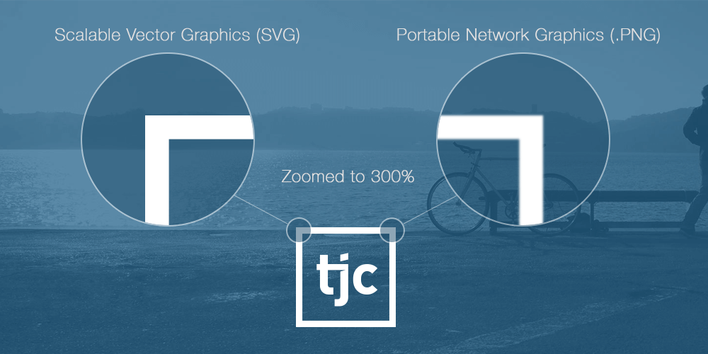
.png or Portable Network Graphics is the most widely used image format on the web. It allows for transparent backgrounds which make it really useful for logos and icons to be placed onto backgrounds.
.jpg or JPEG (Joint Photographic Experts Group) is a commonly used format for digital photographs. If you use a smartphone or a digital camera, you can bet that the photos produced are in this format.
Both formats are what’s called raster (or pixel-based) graphics, which mean that they use pixels to make up the image. The bigger you go, the fewer pixels your logo can use, hence the image can start to look blurry. While both formats have their uses, in today’s ultra-high definition and retina world, they just can’t live up to the task of displaying crisp and clear edges as good as an SVG!
So what’s an SVG?
Scalable Vector Graphics (SVG) is an XML-based vector image format for two-dimensional graphics with support for interactivity and animation.
And what does that mean?
An SVG is essentially a small piece of code that tells your browser the coordinates from one point to another. Or in other words, the edges or boundaries that make up your logo. This means that no matter how big (or small) you scale it, because it’s using geometry, the lines and curves that make up your logo will always stay crisp and clear.
<?xml version="1.0" encoding="utf-8"?>
<!DOCTYPE svg PUBLIC "-//W3C//DTD SVG 1.1//EN" "http://www.w3.org/Graphics/SVG/1.1/DTD/svg11.dtd">
<svg version="1.1" id="Layer_1" xmlns="http://www.w3.org/2000/svg" xmlns:xlink="http://www.w3.org/1999/xlink" x="0px" y="0px"
 width="87px" height="87px" viewBox="0 0 87 87" enable-background="new 0 0 87 87" xml:space="preserve">
<path fill="#FFFFFF" d="M69.482,50.757c-1.546,1.672-3.253,2.509-5.122,2.509c-1.87,0-3.383-0.713-4.543-2.143
 c-1.16-1.426-1.737-2.964-1.737-6.229c0-0.701,0.026-1.322,0.082-1.877c0.197-2,0.75-3.17,1.655-4.288
 c1.16-1.427,2.673-2.142,4.543-2.142c1.869,0,3.576,0.836,5.122,2.509l5.366-5.386c-2.733-2.855-6.242-4.285-10.526-4.285
 c-3.878,0-7.038,1.102-9.486,3.305c-3.181,2.816-4.773,6.332-4.773,12.164c0,5.837,1.593,9.373,4.773,12.227
 c2.448,2.203,5.608,3.307,9.486,3.307c4.243,0,7.751-1.951,10.526-4.849L69.482,50.757z"/>
<path fill="#FFFFFF" d="M42.512,35.492l-5.505,1.49v25.35c0,1.918-0.928,2.877-2.785,2.877h-3.029v7.122h4.529
 c3.06,0,5.425-0.961,7.099-2.877c1.469-1.673,2.204-3.753,2.204-6.243V29.429h-8.018L24.278,29.43v-9.425h-8.017v9.425h-3.367v6.059
 h3.367v15.791c0,2.488,0.734,4.568,2.203,6.241c1.673,1.919,4.019,2.876,7.038,2.876h4.344v-7.121h-2.843
 c-1.818,0-2.725-0.959-2.725-2.876V35.488L42.512,35.492z"/>
<path fill-rule="evenodd" clip-rule="evenodd" fill="#FFFFFF" d="M36.954,19.926l8.079-1.824v6.609l-8.079,1.971V19.926z"/>
</svg>
The same principle is used in print. Just grab a magazine and you’ll see that while the text and most icons and logos look crisp and clear on the page, the photos look just slightly off, unless a real high spec camera has taken the shot. This is because that the text, lines and icons in print are normally created in a vector format.
So, have a good look at your logo…does it look crisp and clear? If not, get in touch with your web team and ask to have your logo displayed in SVG format. After all, your logo is at the forefront of your business. Let it be crisp, clear and as up to date as you and your business are!
Don’t have a web team? Get in touch to see how we can help you.